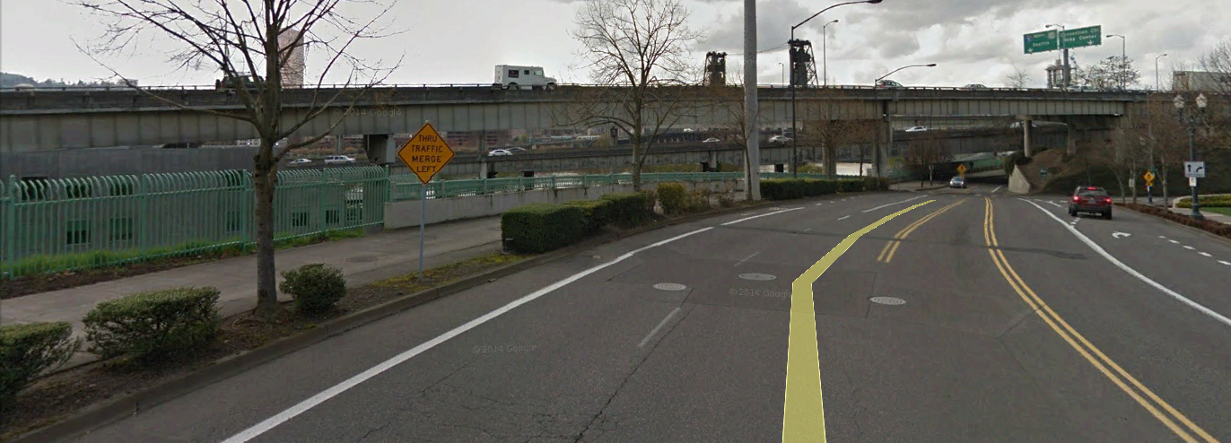
The location of this span is near the Oregon Convention
center. The span’s function is a highway
to carry traffic towards Interstate 5 towards North to Seattle. It is highway 30.
The superstructure is steel girder with varying depth to span
ratios. The smallest span crosses a two
lane road and pedestrian sidewalk. It is
approximately 30’. The Steel girder for
this section of the span is smaller than the previous span. Thus it has a smaller depth girder. The smaller girder sits on the bent cap next to
the larger depth girder. There are two
different thicknesses for the bent cap.
The bent cap rises to meet the smaller girder to create a level
transition.
The superstructure depth to span ratio is bulky. The proportion is not ideal. The span of 30’ has nearly the same girder
depth as the previous girder which seems to span 90 or more feet. This might be because the much smaller girder
would require another bent cap. Further
study is needed to find the right depth to span the 30’. It does however match the next girder’s
depth. Perhaps the designer decided to
match at least one girder to create a smoother transition and to make the bent
cap seat the same for the right bent cap.
One option is to make the girder the same size as the previous
girder. However, the need for clearance
might have motivated the designer to narrow the depth of the girder as much as
can be done. Most like the depth at this
section was to match the next girder and to make ease of construction and
detailing a priority instead of structurally expressing the span to depth ratio
of the girder. The designer could have
celebrated this section of span as a gateway to the city with a smaller girder
and creating haunches to express the gateway towards the city. As is, the column land haphazardly on the
pedestrian sidewalk and the other one extending to another level below.
The bent cap is connected to circular columns. The bent cap cantilevers beyond the circular
column on both ends. The cantilever part
of the bent cap could have been drop to express the structural
proportions. The deck protrudes beyond
the steel girders creating shadows to differentiate the different levels. The effect is to reduce the mass of the
structure and expresses each part of the bridge structure. Underneath the girder there appears to be
diagonal cross bracings which look to be approximately the same depth as the
girder but flush with the bottom of the girder.
The railing is concrete which makes the bridge look bulky. An option is to use metal lattice
railing. But the thin concrete railing
is much smaller than the steel girder that one hardly notices it. Perhaps the concrete railing provides more of
a visual stability for the automobiles which could crash into the railing and
fall onto the highway below it. Some of
the support is shew because there is no room for the column to land due to
serval lanes coming together at various angles which intersect.
Overall the design is not well thought out and the
transitions clumsy. As is typical of
most highway bridges, the way it is designed, priority is given to practicality
and utilitarianism. There were
opportunities to express the structural proportions in the depth to span ratio
and create a unique gate way for the traffic heading toward the city
center.


No comments:
Post a Comment